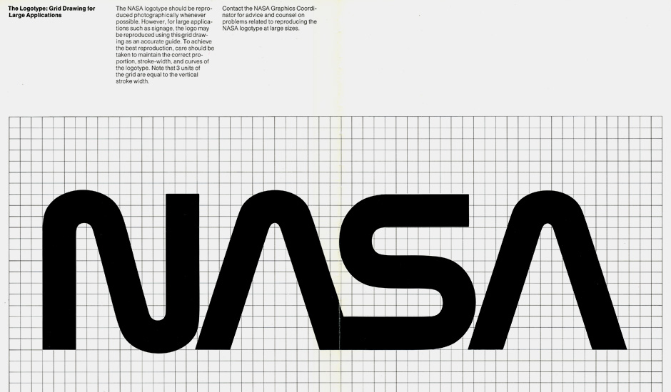
Here’s a really cool article about the design of the “new” NASA logo seen above (which was then dropped in the 90’s to bring back the old “meatball” round logo). I like them both. The worm is the one from when I was a kid in the 80’s, so to me it feels exciting and science-y and space-y… but also a bit dated. I look at it and I think of the movie Space Camp and amusement park rides. The meatball is kinda corny, sure, but in an appealing “Buck Rogers” kind of way. It looks great as an embroidered patch. (I have it printed on a sweatshirt.)